Alley Cat Advocates
Refreshing the brand as they settle in their new location.
(pro-bono)
4 months
August—December
Brand Designer
CONTEXT
Let’s Refresh.
Alley Cat Advocates is a non-profit organization that aims to Trap-Neuter-Return cats most humanely and effectively to stabilize and reduce the unowned cat population. A brand refresh was needed after the organization moved to a new location to better distribute its services. For the class “Design for Public Issues,” designers were teamed up in groups of 4-5 to help a non-profit organization refresh, redesign, or rebrand their organizations, depending on their need for our assistance. This project spanned over an entire semester.

PROBLEMS
Two Concepts, One Choice.
The goal was to create a new, consistent, visual system for Alley Cat Advocates while addressing some of the issues that were set in place for the organization:
Vague Communication
The organization lacks outreach to attract new potential donors, so it must clearly communicate its goals to sustain its efforts. Vague messaging about its services results in confusion.
Confusing Message
Their main goal of increasing awareness of the Trap-Neuter-Return (TNR) program for stray cats is lost within the messages and campaigns of their brand.
Outdated Visuals
Hard to follow visual designs with digital assets and have no straightforward visual design for the physical assets of their brand.
Challenge
Create a new visual system for Alley Cat Advocates by giving the current brand in place a refresh while introducing the organization to new potential donors to increase donations, increase awareness, and continue a sense of community.
Design Solutions
Concise Communication
Smaller, quicker communication of what organization they are at a quick glance.
Inviting Visuals
Reoccurring color palettes and overall illustrative look to welcome new volunteers and audience.
Community Involvement
Keeping the original logo, slight changes and multiple orientation creations were done to make the logo and brand versatile of different types of uses.


GROWING PAINS
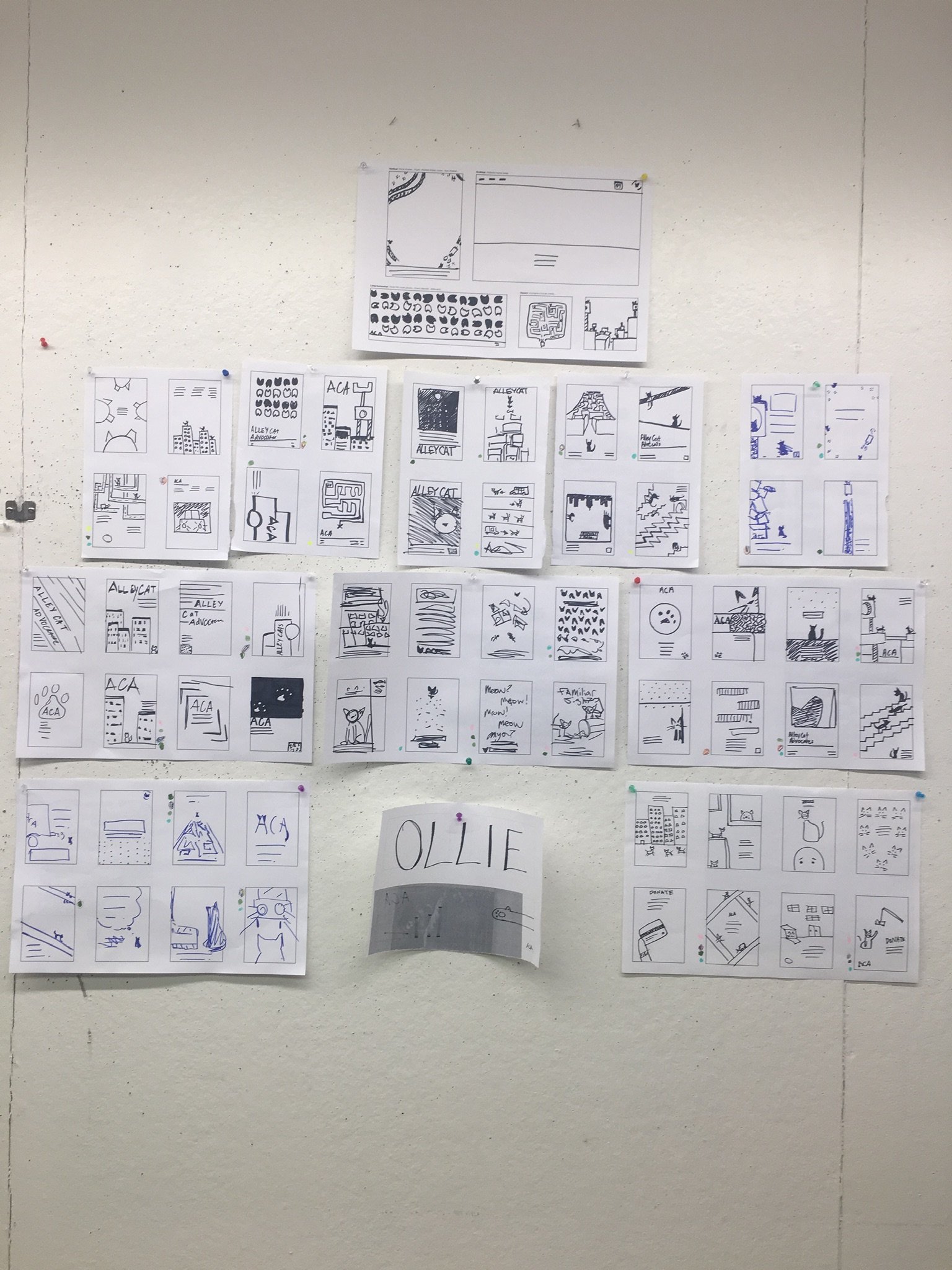
Moodboards.
Two directions were considered after the meeting with the director of the organization. One was more of a modern, geometric approach to their brand, going for darker, earthy tones for the professional side of the brand. The other was friendlier and warmer, with vibrant, illustrative colors to help create an inviting look for prospecting newcomers, volunteers, and sponsors to approach them.


Current version of the logo (top left) compared to redesigned logo (top right and bottom)old designs with the current logoNeed to create one more moodboard to combine the two to better represent Alley Cat Advocates and their overall message.
Current logo needed to be in place as new location was already redecorated before the semester project was announced and finished.
Lack of organization with their content to better provide service and information to new potential volunteers and donors.
Further discussions and clarifications brought a more narrow focus to refreshing the surrounding materials surrounding their advertisements, website, visuals, and promotions of their brand while creating a brand stantards for their organization.
Patching things up.


When presenting the two options to the client, they couldn’t decide which one to choose. They liked certain aspects of both moodboards, so we decided to merge the two together. When it came to the logo, they liked the idea of the refresh, but a few issues had been raised: the current logo was made by a friend of theirs, and they had already decorated the new location with the current logo they had.
Pinpointed issues.
Option A: OllieOption B: Sally


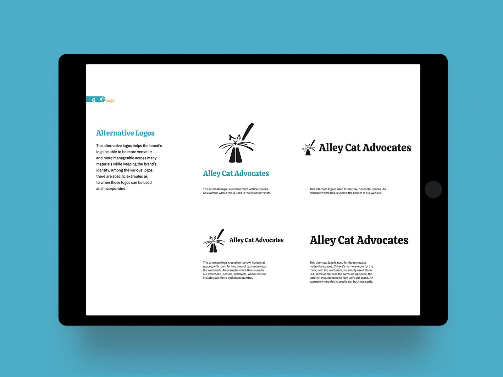
The mark was kept the same, and the typography was redone to be more legible and friendlier for their target audience. Different iterations were created for various uses of their logo.
Logo
Addressing specific needs and versatility in the organization's deliverables to mark its brand and makes it more recognizable.


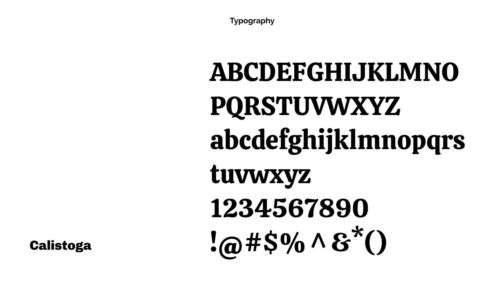
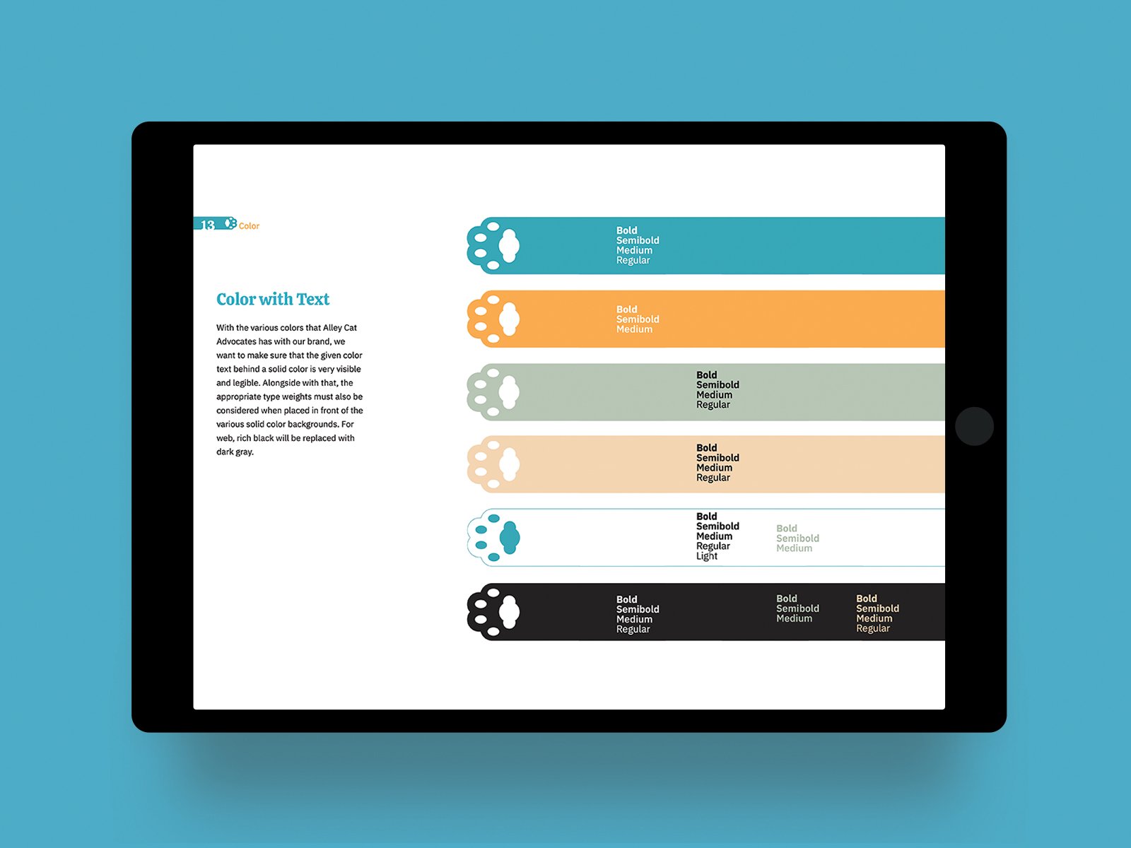
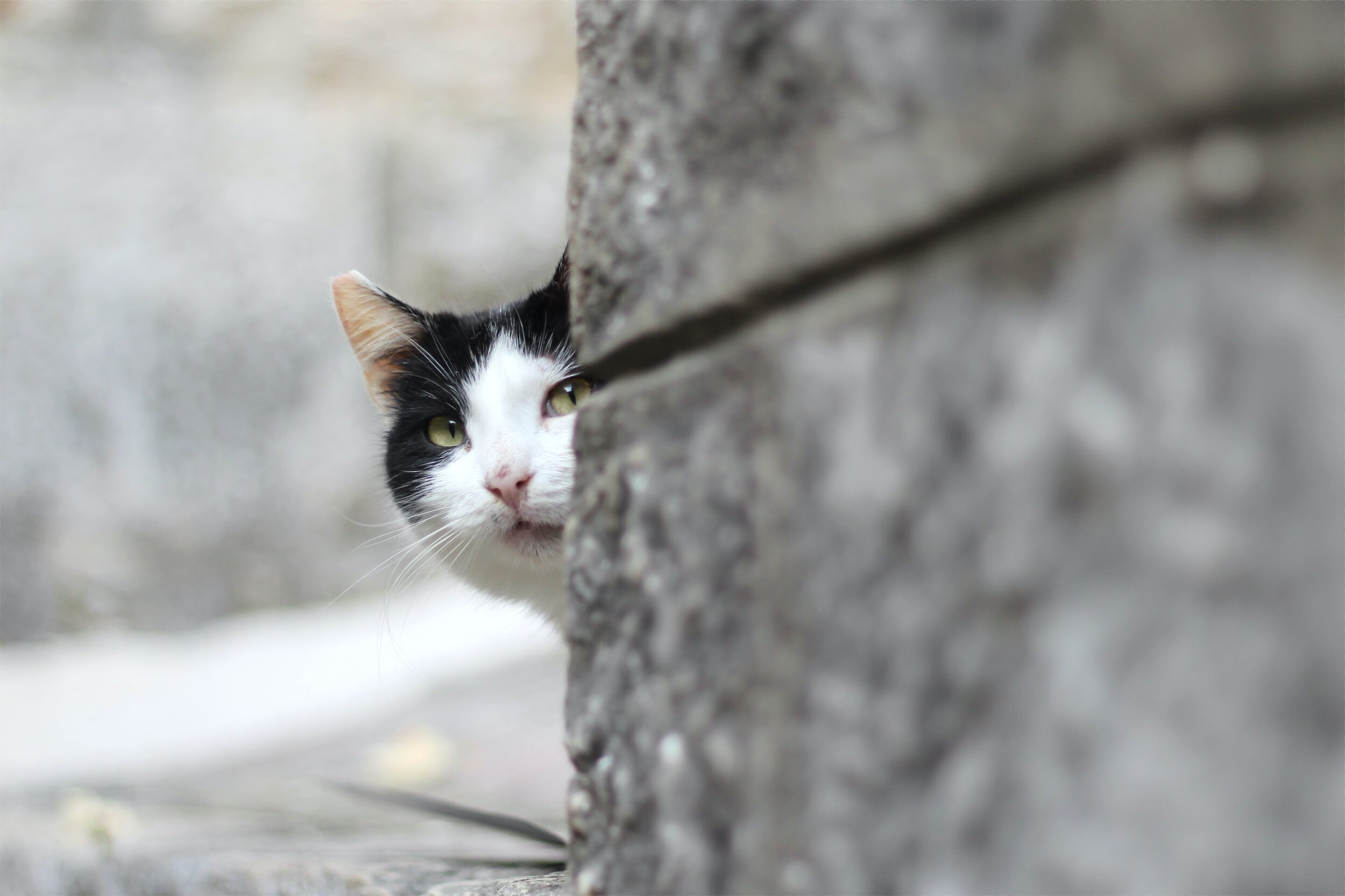
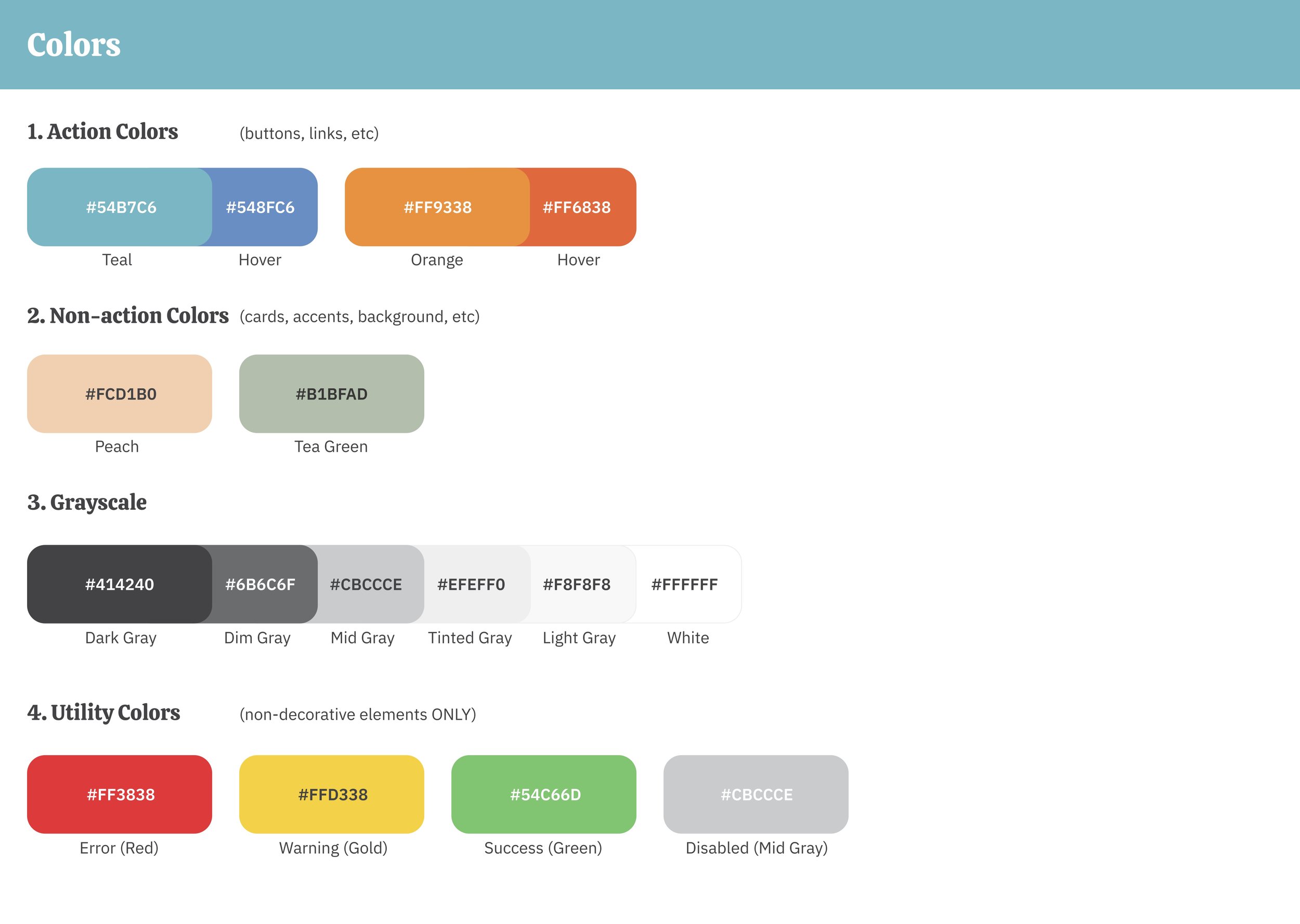
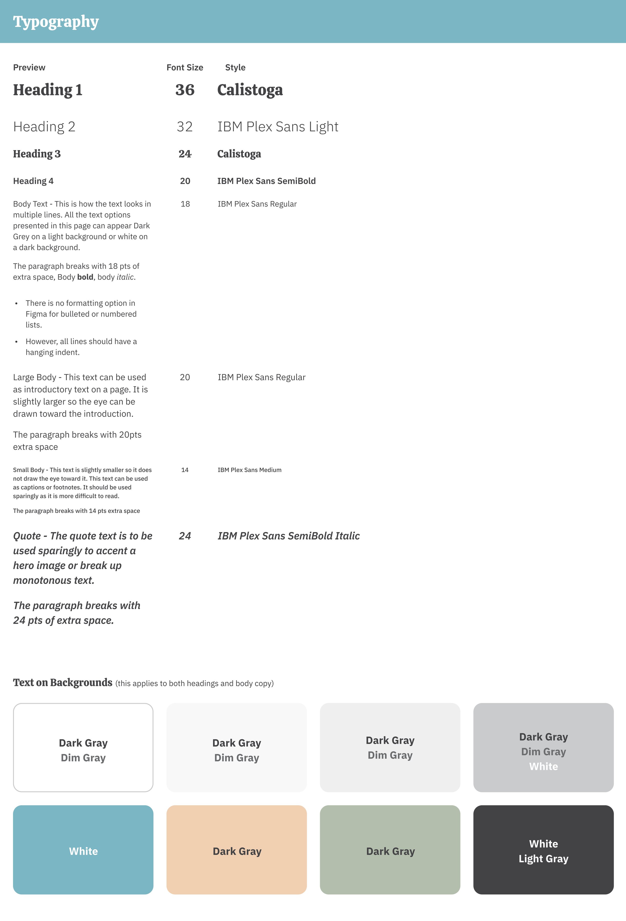
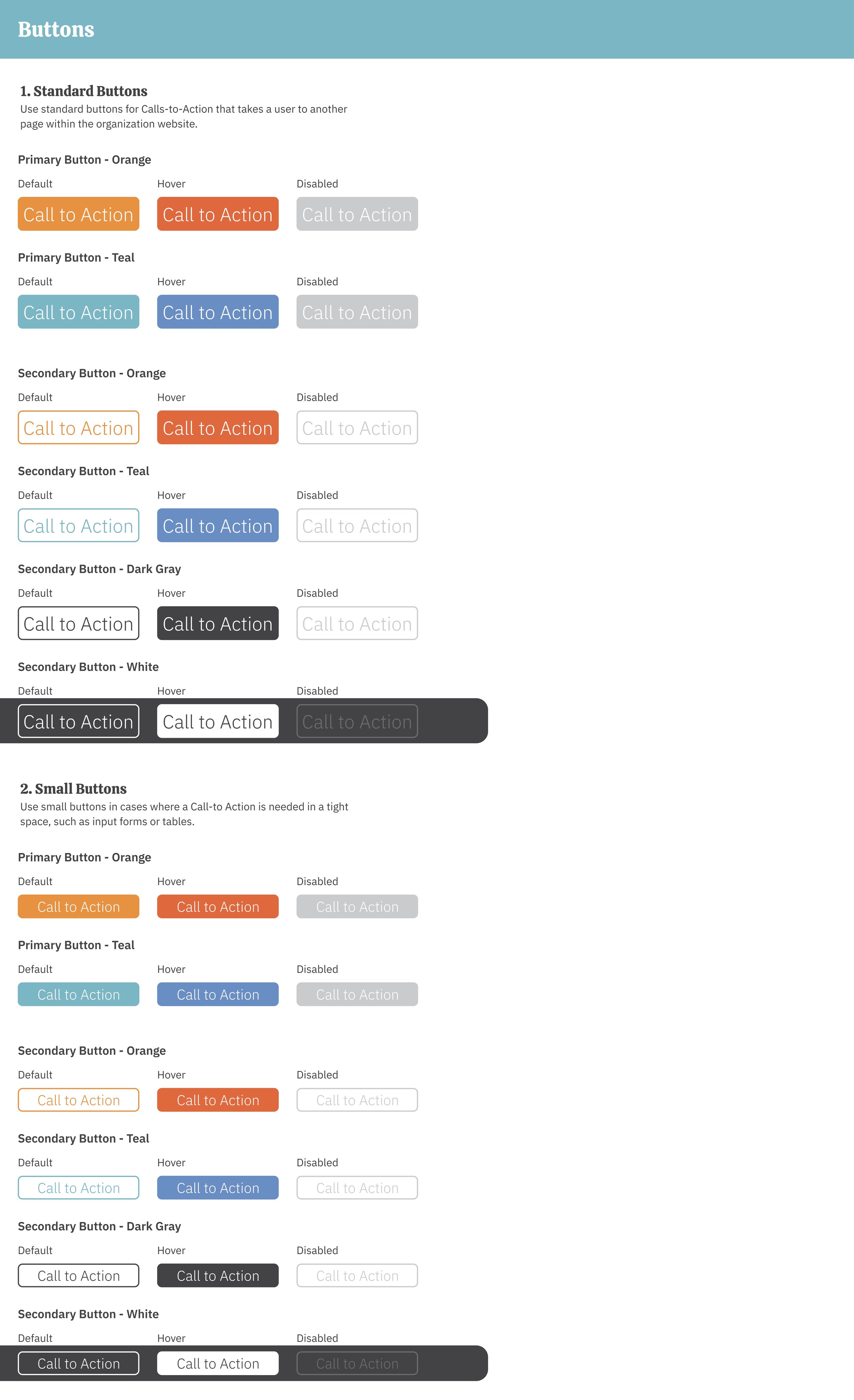
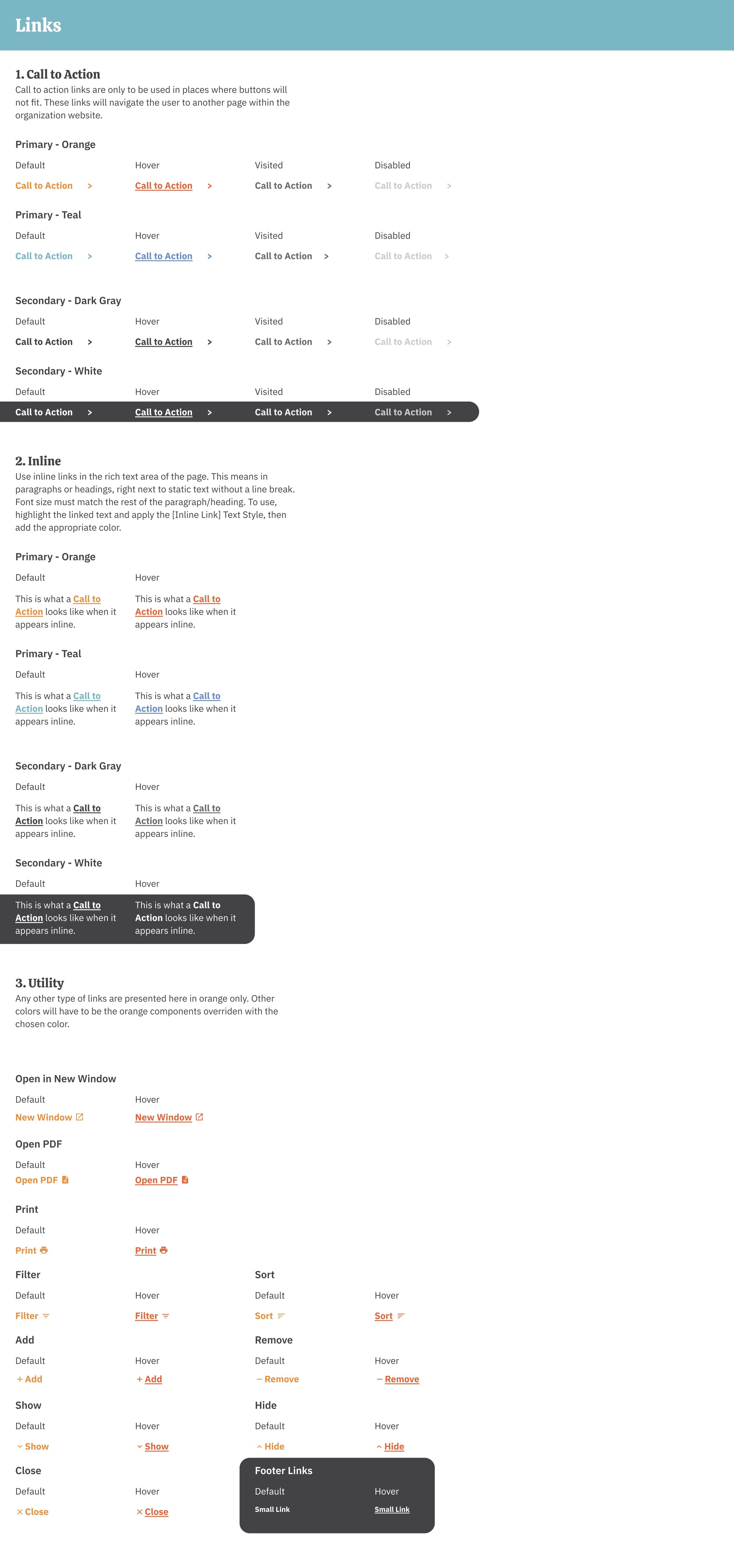
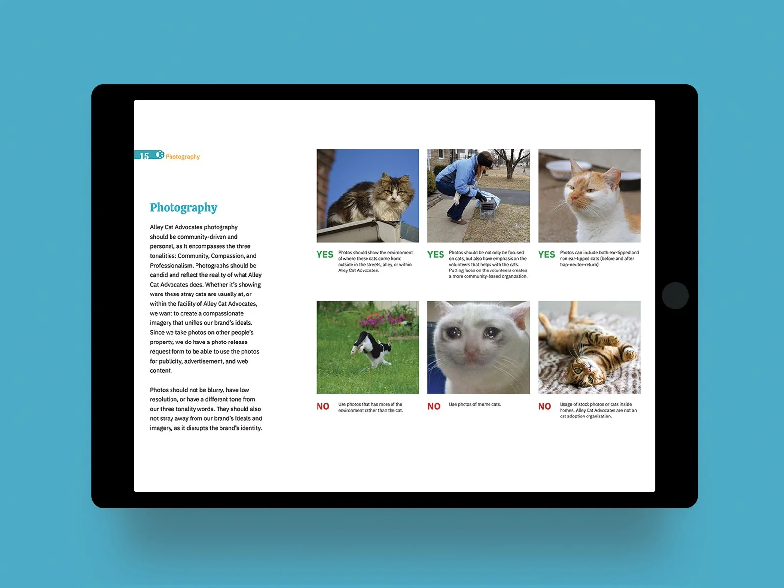
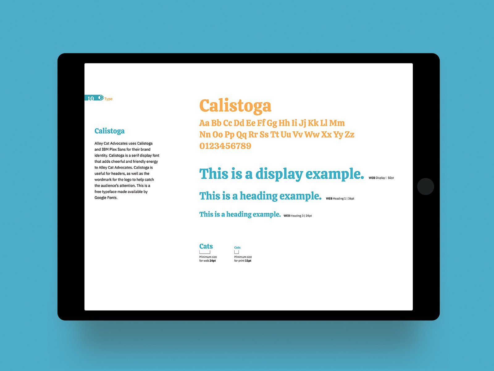
My role within the group of five designers was to create the brand standards book and create the brand elements to use all across the brand. Colors, typography, and illustrative paws were the main design considerations for the refreshment of their brand. Establishing the use of cat photos was also important for marketing and branding. I was also the notetaker and researcher of the group, so documenting the progress, research, and ideations that worked and didn’t work helped to assemble the process and the culmination of the brand design book. Considering that this was happening during the COVID-19 pandemic, the group ultimately decided to make the brand design book digital to help their volunteers access it easily.
Brand Elements.

Creates cohesion across all media for marketing and branding purposes.
Accessible for others to send and use digitally or to potentially go to print physically.


Printed materials such as flyers, business cards, letter documents for sponsors, and door hangers were considered for their refreshed designs. Their main cause is to help spread information not only about their organization and what they do but also about the safe practices of their Trap-Neuter-Return system and how to go about helping if someone finds a stray cat in the neighborhood.
Printed Deliverables.
Creates a cohesive look across the brand to make it more recognizable across the community.

Volunteer materials were also hypothesized for easier visual communication of who the volunteers are versus the directors and leaders of the organization.
Volunteers
Creates a visual distinction between the volunteers versus the directors of the organization.

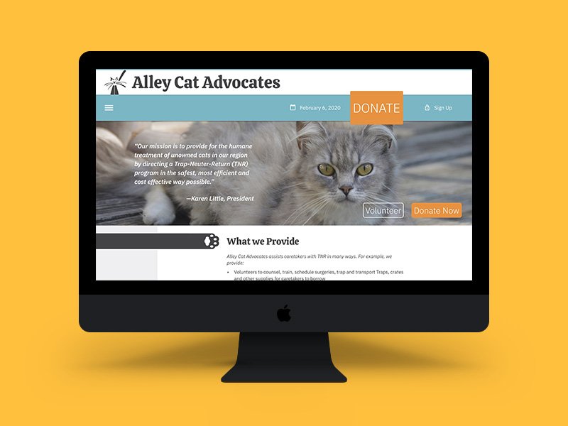
A website redesign was also considered to improve navigation and deliver condensed information, allowing users to quickly and readily understand their program. All of the components were created in Figma.
Web Redesign.


The digital version of the brand guidelines for the non-profit organization.
Brand Guidelines.
LOOKING AHEAD
Retrospective
Working in collaboration with the non-profit organization on our Design for Public Issues course in-person was an enlightening experience for me to understand how to navigate the process of presenting, understanding, and designing for the client and stakeholders. Given that it took the whole semester to start and finish the project, and finish the project cycle, it was a nice dip in my toes to collaborate and design for others outside of college.
